Effective web design doesn't have to be pretty and colorful – it has to be clear and intuitive; in fact, we have analyzed the principles of effective design in our previous posts. However, how can you achieve a clear and intuitive design solution? Well, there are a number of options – for instance, you can use grids, you can prefer the simplest solutions or you can focus on usability. However, in each of these cases you need to make sure your visitors have some natural sense of order, harmony, balance and comfort. And this is exactly where the so- called Divine proportion becomes important.
This article explains what is the Divine proportion and what is the Rule of Thirds and describes how you can apply both of them effectively to your designs. Of course, there are many possibilities. Hopefully, this post will help you to find your way to more effective and beautiful web designs or at least provide some good starting points you can build upon or develop further.
Divine Proportion
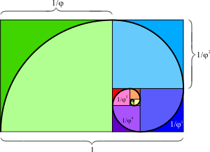
Since the Renaissance, many artists and architects have proportioned their works to approximate the golden ratio – especially in the form of the golden rectangle, in which the ratio of the longer side to the shorter is the golden ratio. The rationale behind it is the belief that this proportion is organic, universal, harmonic and aesthetically pleasing. Indeed, being evident everywhere in the universe (in fact, many things around us can be expressed in this ratio), divine proportion (which is also called Golden ratio, divine section, golden cut and mean of Phidias) is probably the most known law of proportion which can dramatically improve the communication of your design.
As Mark Boulton states in his article Design and the Divine Proportion, "one of the key components in the vehicle of communication is composition, and in design schooling it is something that is taught as something you should feel rather than create logically." Hence, to comfort your visitors with a pleasing and intuitive composition it is often worth considering the Golden ratio. So what exactly is Golden ratio? Basically, it is a proportion 1.618033988749895 ≈ 1.618 which holds between objects placed within some context.
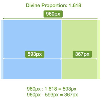
Consider the example above. You would like to create a fixed width layout. The width of your layout is 960px. You would to have a large block for your content (#content) and a smaller block for your sidebar (#sidebar). How would you calculate the widths of your columns?
- First, calculate the width of your #content-block. You need to make sure that the ratio between this block and the overall layout width is 1.62. Hence you divide 960px by 1.62 which results in approximately 593px.
- Subtract 593px from the overall layout width (which is 960px) and get 960px – 593px = 367px.
- Now if you calculate the ratio between the #content-block and the #sidebar-block (593px : 367px ≈ 1.615) and the ratio between the container-width and the width of the content-block (960px : 593px ≈ 1.618) you have achieved almost the same ratio.
This is the whole idea behind the "Golden" proportion. The same holds for fluid and elastic layouts, too.
Of course, a web design doesn't need to be organized according to the Divine proportion. However, in some cases it can improve not only the communication of your design, but also improve further details of your layouts. As an example consider The 404 Blog. The design itself is visually appealing, provides calm and supporting color scheme and has a nice composition.
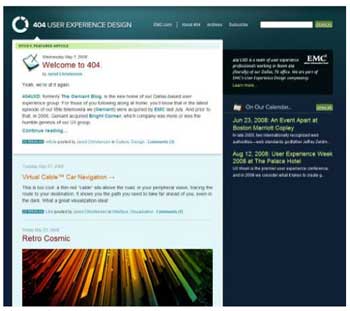
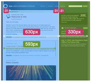
However, the design does not correspond to the Divine proportion as you can see from the image below. Actually, users don't necessarily feel it, because they intuitively split the layout in two separate blocks of the width 583px (630px – 31px – 31px) and 299px (330px - 31px). The reason behind it is that white space of the main area is passive (three columns, each 31px wide), it clearly supports the content next to it rather than being the content itself.
The ratio between the layout blocks is 630 : 330 px ≈ 1.91 ≠ 1.62, and the ratio between the content blocks is 583 : 299px ≈ 1.92 ≠ 1.62. The reason why the layout looks almost perfect although it doesn't stick to the Divine proportion is the simple fact that it is balanced – both the layout blocks and the content blocks have the same proportion. Hence the design provides some sense of closure and structural harmony.
The interesting thing is, however, that due to a suboptimal layout length visitors are offered a suboptimal text length of over 90 symbols per line. However, an optimal number for comfortable reading lies between 60 and 80 symbols per line. The improvement of the layout would therefore lead to the improved readability of the content, too. That's a useful side- effect of getting things done according to the laws of nature.
For some quick'n'dirty drafts you may use the ratio 5 : 3 which is not exactly the Divine proportion, but can turn out to be a useful rule of thumb in case you don't have a calculator near you. Divine proportion usually provides bulletproof values one can perfectly incorporate in almost every design. When working on your next project you may want to consider using the following tools to calculate the widths "on the fly":
- Phiculator
Phiculator is a simple tool which, given any number, will calculate the corresponding number according to the golden ratio. The free tool is available for both Win and Mac. - Golden Section Ratio Design Tool
Atrise Golden Section is a program, which allows avoiding the routine operations, calculator compilations, planning of grouping and forms. You can see and change the harmonious forms and sizes, while being directly in the process of working on your project.
The Rule of Thirds
Basically, the Rule of Thirds is a simplified version of the Golden ratio and as such poses a compositional rule of thumb. Dividing a composition into thirds is an easy way to apply divine proportion without getting out your calculator.
It states that every composition can be divided into nine equal parts by two equally-spaced horizontal lines and two equally-spaced vertical lines. The four points formed by the intersections of these lines can be used to place the most important elements – the elements you'd like to give a prominent or dominant position in your designs. Aligning a composition according to Rule of thirds creates more tension, energy and interest in the composition than simply centering the feature would.
 This photograph demonstrates the principles of the rule of thirds. Source: Wikipedia
In most cases it is neither possible nor useful to use all four points to highlight the most important functions or navigation options in a design. However, you can definitely use some of them (usually one or two) to properly place the most important message or functionality of the site. The left upper corner is usually the strongest one, since users scan websites according to the "F"-shape.
So how do you split a layout into 9 equal parts? Jason Beiard states the following method for applying the Rule of Thirds to your layouts:
- To start the pencil-and-paper version of your layout, draw a rectangle. The vertical and horizontal dimensions don't really matter, but try to keep straight lines and 90- degree angles.
- Divide your rectangle horizontally and vertically by thirds.
- Divide the top third of your layout into thirds again.
- Divide each of your columns in half to create a little more of a grid.
- You should have a square on your paper that looks similar to the rule of thirds grid.
Let's consider the following situation. Assume you have a layout of fixed width 960px. Consider the area above the fold which is likely to have the height between 750 and 950px.
- Divide the width of your layout by 3. In an example you get 960px / 3 = 320px.
- Divide the height of your layout by 3. In an example you get ( (750 + 950 px) / 2 ) / 3 ≈ 285px.
- Each rectangle should have the size of 320px × 285px.
- Construct the grid of the rectangles described in step 4 by drawing lines going through the ends of rectangles.
- Place the most significant elements of your designs in the meeting points of horizontal and vertical lines.
Consider the design of the website presented below (formerly Demandware.com, now owned by Salesforce). Although the design uses a number of vibrant colors, it is not noisy and seems to be both simple and clear. The navigation options are clearly visible and the structure of the site seems to be easy to scan.

However, if you consider the effectiveness of this design, you might find a perfect balance the design actually has. Indeed, it almost perfectly uses the Rule of Thirds as two out of four intersections of the lines (pink blocks in the picture below) contain exactly the information which the company wants its users to see – namely what the site is all about and an example of their work. Note also how perfectly the main sections are placed on the second horizontal axis. That is effective.

Rule of Thirds in use: two out of four intersections of the lines (pink blocks) contain exactly the information which the company wants its visitors to see.
Summary
In some cases, applying the Divine proportion and the Rule of Thirds may significantly improve the communication of your design to your visitors. Offering your users an almost natural balance in proportion 1 : 1.62 you literally impose the natural order on it and force your design layout to become more scannable and well-structured.
Using the Rule of Thirds you can also effectively highlight important functions of your site providing your visitors with a design they can easily work with and effectively delivering the message you want to deliver in the first place.
Source Notes
This article was first published in Smashing Magazine, © 29 May 2008; reprinted with permission.
Vitaly Friedman

Vitaly Friedman loves beautiful content and doesn’t like to give in easily. Vitaly is writer, speaker, author and editor-in-chief of Smashing Magazine. He runs responsive Web design workshops, online workshops and loves solving complex UX, front-end and performance problems in large companies. He may be contacted through Smashing Magazine.

